Redesigning the DaVita.com mobile navigation experience
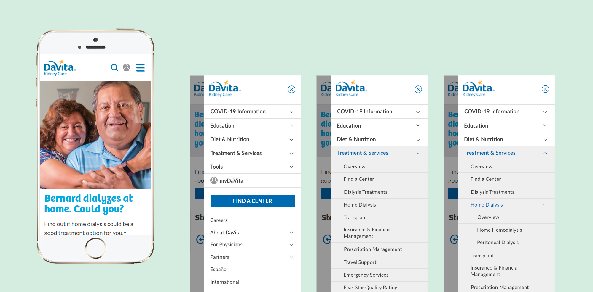
DaVita is one of the largest providers of kidney care services in the U.S. Following a major website rebrand, issues emerged with the mobile navigation, and my team was tasked with improving usability.
01 / KEY HIGHLIGHTS
- Overhauled complex navigation architecture for enterprise healthcare website serving 5+ user types
- Led end-to-end design: research, prototyping, usability testing, and stakeholder alignment
- Increased mobile myDaVita registrations by 8% and Find a Center searches by 22% YoY
- Validated designs through remote usability testing with kidney disease patients
02 / RESULTS & IMPACT
- Drove higher conversions by increasing engagement with key features, including myDaVita registration and Find a Center searches
- Improvements to mobile navigation in the tech stack streamlined development, reducing maintenance effort and supporting more efficient feature rollouts
03 / PROJECT GOALS
The DaVita website supports multiple audiences, including dialysis and pre-dialysis patients, caregivers, hospital partners, and physicians, across a complex ecosystem of more than 10,000 pages. This project focused on simplifying navigation and improving the mobile menu experience to help users find what they need more quickly and confidently.
Our Objectives
- Increase content discoverability and help users accomplish goals faster through improved wayfinding
- Enhance visual hierarchy an UI styling in the mobile menu
04 / DESIGN PROCESS
Research & Discovery
Our team reviewed analytics data, performed competitive benchmarking, and held a team brainstorming session to identify best practices for complex mobile navigation.
Concept Development & Testing
I collaborated with another designer to create two clickable prototypes, including a tabbed mobile nav and an improved hamburger menu. We tested both concepts in Userlytics with users connected to kidney disease, gathering feedback on task completion and navigation preferences.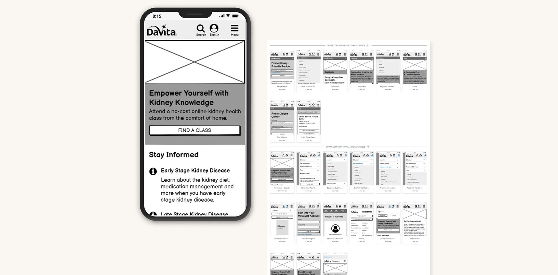
Clickable prototype concept 1 of 2 that was included in usability testing.
Design Refinement
After analyzing user feedback, I created final wireframes and design mockups that combined the most successful elements from both prototypes.
Development Handoff
I provided visual mockups and detailed specifications to the development team, including an overview of font sizes, padding, and styling recommendations aligned with our brand guidelines.
05 / SOLUTIONS
A large number of small but important changes were made to improve the mobile navigation experience.
Simplified Menu Structure
Based on usability testing feedback, we kept the hamburger menu design over the tabbed navigation, as it required fewer clicks to complete tasks.
Streamlined Sign-In Experience
Redesigned the myDaVita account sign-in experience from an on-page form to a more seamless modal window, reducing friction for users accessing the Health Portal and social networking features.
Enhanced Visual Hierarchy
Made primary navigation links bold and secondary links regular weight to create clearer visual hierarchy, where previously all links were the same size and style.
06 / WHAT I LEARNED
The biggest challenge was balancing a wide range of multiple stakeholder priorities with user needs while keeping the navigation simple. This project taught me a lot about designing for a massive website ecosystem, one that needs to work for everyone from dialysis patients to hospital administrators to caregivers.
Client:
DaVita
Project:
DaVita.com Mobile Navigation Redesign
My Role:
Wireframes, Mockups, Prototypes, User Testing
